Branding for the local cafe "Red Emma's," involving the redesign of their logo, merchandise, and booklets. Designed to align with their ideology and values.
Founded in 2004 as a volunteer-run anarchist bookstore in Baltimore, Red Emma’s added a cafe to strengthen its financial foundation and create a more welcoming space. They aim to spread radical ideas beyond those already radicalized. Today, Red Emma’s hosts DIY sessions and conferences to share information and empower the fight for a better world.


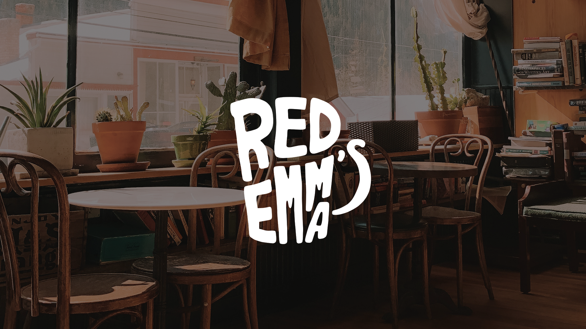


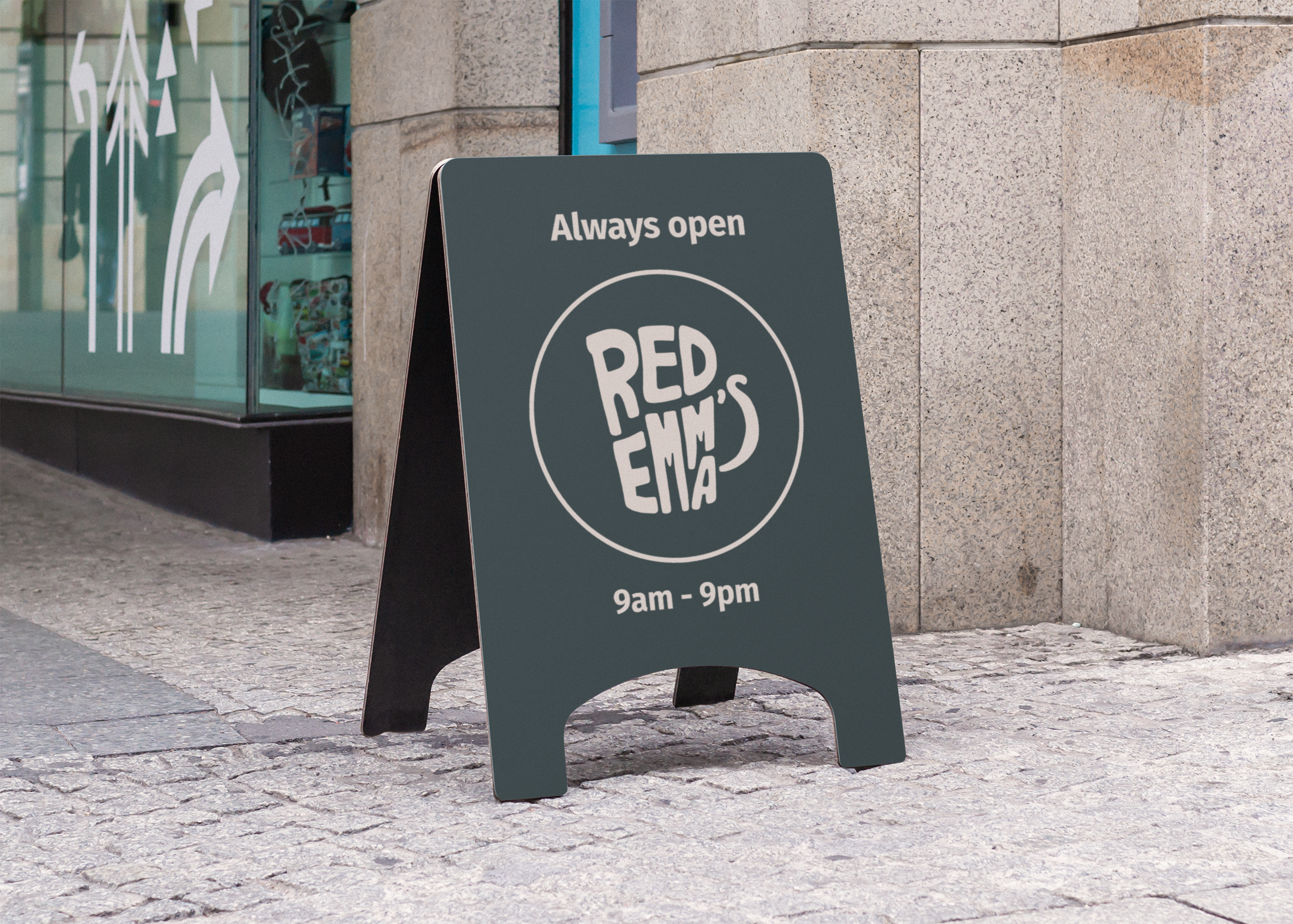


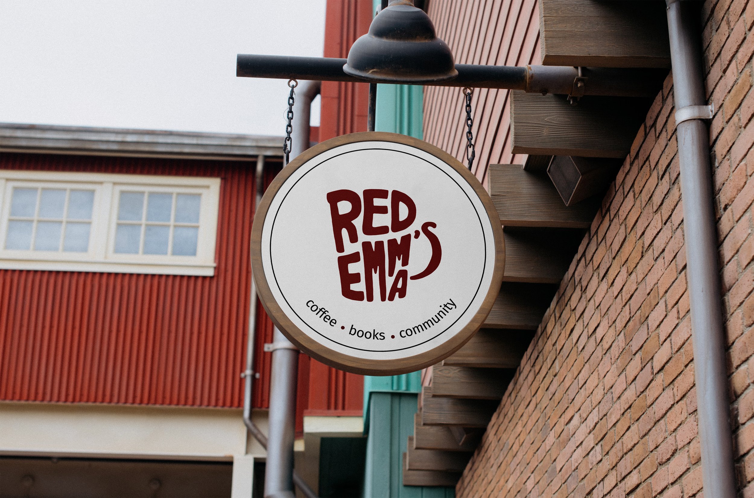
The Red Emma’s logo is a key element of the brand, representing the company's ideals, increasing recognition, and distinguishing it in the marketplace. Its hand-drawn, organic style reflects Red Emma’s DIY, infoshop, and anarchist-bohemian identity. The letters form a coffee mug, symbolizing the café-bookstore concept. The varied sizes, shapes, and positions of the letters emphasize cooperation and community, highlighting the equal opportunity for everyone to share ideas in the Red Emma’s space.
